Featured Logo Designs
Logo Design Process
My goal, as with every logo design, is to work with you to create a unique and effective representation of your brand. In order to achieve this, I have developed a process that consistently yields successful results.
Research begins by assessing the nature and identity of the business and its culture in order to develop a thorough design brief with which to base the proposed concept designs on.
Applying the information gathered in the research stage, I will concept a variety of different design approaches for initial evaluation, review, and discussion. From those design concepts, I will present a selection of designs which I feel have the potential to be the most successful. Your logos will also be presented to you in mockup form (ex: on a business card, signage, etc). This will give you a better sense of what the logo will look like in real life application, or as part of a cohesive brand.
The Cleveland Alzheimer’s Disease Research Center (CADRC)
CADRC is a National Institute on Aging Center which has the goal of increasing the speed of research being done on aging-related brain disorders. The 8 shapes shown in the logo mark represent the 8 core divisions that comprise the services provided by the CADRC. Each box tilts at a 45 degree angle, giving the impression that it is moving the adjacent one forward and that all the shapes are moving in unison. The center of each square is placed at the corner of an octagon, a shape commonly used in logo design to evoke the feeling of collaboration and organization.
MALT.chat
MALT (Messaging with Automatic Language Translation) is a web application that makes it fast and simple to chat with anyone in any language without the need to jump back and forth from a translation tool. The logo design is meant to invoke the idea of language and global communication as an abstract symbol that has a friendly impression through its use of colors, symbolism and font style.
Simple Ledger, Inc.
Simple Ledger is a team of software developers and consultants who focus on building decentralized applications to manage secure, immutable data utilizing the power of the Bitcoin blockchain. The logomark is built from combined triangular shapes that form the shape of the S. The triangle motif is extensible, in that it can be used to build any form with unlimited possibilities – much like the wide variety of use cases developed from SLP. The triangle design can also be used to create custom icons and other graphics for a consistent brand design.
Ears To You
Ears To You is a non-profit organization that donates earrings, bracelets and hats to cancer patients to lift their spirits by creating a moment of joy and hope. Redesigns included new logo, website, tri-fold brochure and business cards.
Suburban Symphony Orchestra
The Suburban Symphony, one of Cleveland’s premiere community orchestras needed a new logo design for use on their print and online marketing materials. They wanted a graphic/type logo combination that would work well in multiple sizes, large and small including apparel. The logo needed to be simple, elegant and represent classical music. The curved shapes used in the logo design represented not only the “S” in the company title, but also the shapes found often in classical instruments. The elegant shape of the symbol works well as a design element for their print marketing collateral and stationary.
Gross Residential
Gross Residential is a developer, builder, and manager of residential housing and apartment communities that have been in business for over 100 years. They were looking for a logo redesign that visually represented the company name as well as key aspects of the business. It needed to work well in all sizes and formats as part of a complete branding package. A similar component of all of the designs I proposed was the letter G combined with a rooftop to symbolize home. The symbol, as well as the font style is strong and balanced, traditional yet slightly contemporary.
Civilize Software
Civilize Software creates software used by businesses and practitioners within the civil engineering, architecture, and construction (EAC) industry. Their software aims to improve the efficiency and accuracy of the design project delivery process and construction document publishing, and eventually the construction management process. The main concept for the company to be illustrated in the design was “Bridging the gap between EAC teams and their designs.”
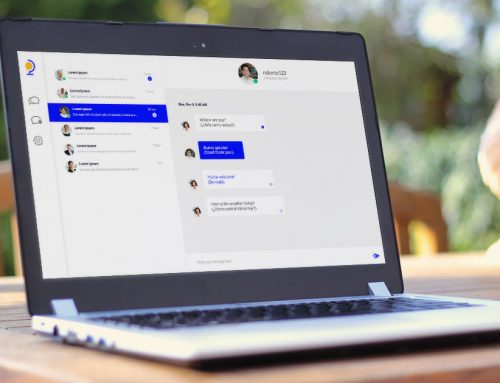
Votebox
Votebox is a powerful and unique blockchain based voting application that leverages the immutability and transparency of public blockchain technology for private and public voting. The design combines a speech balloon/voice of the voter with the shapes of a ballot box and checkmark.
MCG
MCG is a division of Millennia Companies that has been created to lease and manage commercial properties as well as full-brokerage leasing. The logo design focuses on font style and color to convey the attributes of the business. The use of a slab serif font as well as the blue color conveys professionalism and trustworthiness. The darker shade of blue provides a sense of sophistication, formality, and authority. The rectangular frame conveys stability, reliability, strength, order, and predictability like the bricks that are used to build sturdy, stable buildings.”